Wednesday, September 29, 2010

Saul Bass Poster

west_side_story_xlg.jpg
The design of this poster, as true with all of Saul Bass' work, is exceptional. It is very clean and simplistic, yet it tells the viewer everything they should expect from the movie. The text is somewhat industrial and there is an illustration of a staircase one would find on the outside of a building in New York, telling us that the story takes place in a city. There is a hint of blood splatter, hinting at conflict, or violence. The two figures, a male and a female, are shown dancing so we can infer that the movie will be a musical. Drawn at the top in black the figures are united, meaning that during the night they are able to secretly see each other. Towards the bottom of the page, the figures are separated and are drawn in white, meaning that in the day and out in the open they are forced to be apart. Saul Bass is very good at telling a lot of information with only a little.

Friday, September 24, 2010

Comic book characters


Comic book characters whose personality is defined by style:

Johnny the Homicidal Maniac:
   Jhonen Vasquez use only black and white to give Johnny, and the whole comic, an insane, twisted, and dark mood. It is "cartoony" enough to allow the reader to realize its just pretend, but at the same time while reading the comic, its hard to not be a little frightened. Jhonen uses rough edges for all the comic panels to push the sense of insanity a little further. Also, the speech bubbles style changes as the characters mood changes.

Perry Bible Fellowship:
    Nicholas Gurewitch draws his web comic strip with a very childlike feel. The colors are bright, the characters look very friendly and its very simplistic. Once creating this welcoming childish atmosphere, Gurewitch throws in a morbid, sudden or unexpected twist. He uses the simplicity of the strip to allow him to get away with talking about things like religion, sexuality, war, science fiction, suicide, violence, and death.
Homer Simpson:
   Matt Groening's iconic character Homer Simpson is someone anyone can identify with. His personality is one in someone would relate to either because they are that person, or they know that person. He is the stereotype for the american dad. Groening is also able to poke fun at and talk about things that aren't usually easy to talk about, simply because the art style of The Simpsons easily represents the real world, but is also easily shrugged off as fantasy and fiction.

Thursday, September 16, 2010

Typographic Self Portrait

When the class looked at my self portrait, among the words used were "tired, staring at a computer, and living in a basement." Though these words do not accurately depict me as a person, I definitely see them in the composition. In this project, I put a lot of thought into the style in which I depicted myself and was really satisfied with the way it turned out in that respect. I realize though, that I did not spend enough time in choosing the subject matter. Since I did not want to depict myself this way, I should have chosen a different picture to work from rather than one I took after staring at the computer for a while. I didn't put any life into the caricature I made and if I wanted to represent different elements about myself I should have paid more attention to the expression on my face, and my posture.

Wednesday, September 8, 2010

Wednesday, September 1, 2010

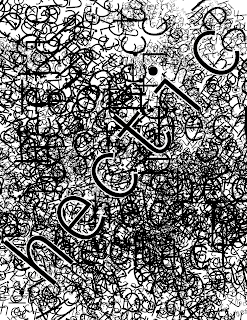
Typography and Composition Ex.3 Texture and Depth

(reuploaded to change the name to edgar-03)
The responses given were phone chord and slinky. This was the texture I was going for when making this composition.